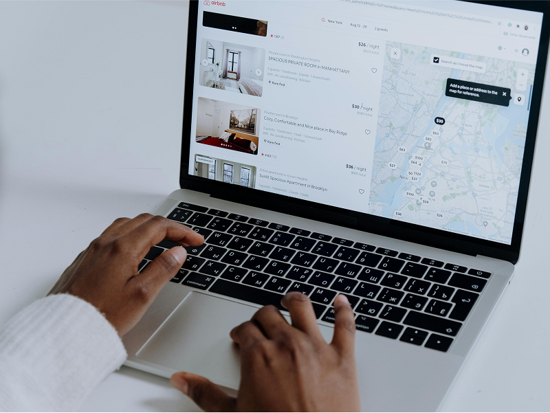
Designing user experiences for travel platforms isn’t just about beautiful interfaces. It’s about helping real people make decisions for their vacations, business trips, honeymoons, and life experiences.
In the fast-paced world of travel-tech, UX must go beyond aesthetics. It needs to solve real user frustrations, manage complex data, and deliver a smooth, stress-free booking journey across flights, hotels, holiday packages, cruises, and more.
Here are the key UX lessons I’ve learned while designing and optimizing multi-service travel platforms:
1. Complexity is the Default. Clarity is the Goal ✈️
Travel booking platforms involve:
- Multiple APIs (flights, hotels, weather, visa)
- Real-time data (availability, pricing, tax, baggage rules)
- Conditional flows (seat selection, room upgrades, passenger filters)
- Multi-step forms and payment processes
Lesson:
Design should always aim to hide complexity, not eliminate it. Show only what matters at each step. Use progressive disclosure to reduce overwhelm.
🔍 Example: In flight results, instead of listing full baggage rules upfront, use icons and tooltips to keep the UI clean. Details only appear when the user wants them.
2. Design for Decision Fatigue 🧭
Users don’t always know where to go, which hotel to pick, or which flight is best. They compare dozens of tabs and bounce easily.
Lesson:
Use UX to guide decisions, not just display options.
- Pre-select the cheapest or most relevant flight/hotel
- Show badges like “Most Booked” or “Best Value”
- Use visual comparison blocks and smart filters
📌 Pro Tip: Fewer, smarter filters convert better than overloaded dropdowns.
3. Mobile First ≠ Desktop Shrunk 📱
Most travel bookings start on mobile, even if they’re completed on desktop.
Lesson:
Mobile-first UX isn’t about scaling down. It’s about rethinking the journey:
- Sticky search bars
- Card-based result listings
- Bottom-fixed CTA bars (Book Now, Save for Later)
- One-hand reach design for key actions
🧠 Insight: Seat maps, hotel galleries, and date selectors need thumb-friendly, swipeable interfaces—not zoomable desktop replicas.
4. Friction Points = Drop-Off Points 🛑
Every extra step, especially during checkout is a risk.
Lesson:
Minimize friction in high-stakes moments:
- Pre-fill passenger data from saved profiles
- Auto-suggest city names, card types, and expiry formats
- Provide upfront clarity on refund or cancellation policies
💸 Result: Fewer abandoned bookings and increased user confidence.
5. UX Consistency Across Multiple Travel Services 🧳
If your platform supports flights, hotels, holidays, cruises, activities, and transfers, t’s tempting to design each experience in isolation.
Lesson:
A shared design system ensures:
- Consistent layout and UI behavior
- Faster feature updates across modules
- A familiar experience for users regardless of the booking type
🎯 What worked for us:
- Shared components for filters, modals, and CTA sections
- Aligned microcopy across all services (e.g., “Continue to Book” instead of varying CTAs)
- Consistent mobile patterns like bottom sheets and date pickers
6. Emotion-Driven UX Increases Retention 🎨
Travel is emotional. UX should tap into that energy, excitement, curiosity, nostalgia, and reassurance.
Lesson:
- Use vibrant hero images to inspire exploration
- Display reviews, testimonials, or “travel goals” boards
- Include loyalty features like “members-only deals” or reward points
- Incorporate contextual info like weather forecasts or local tips during trip planning
🌍 Example: Adding an “Itinerary with Weather Forecast” view increased engagement time and reduced bounce rate before checkout.
7. Analytics + UX = Continuous Improvement 📈

UX is never “done.” We constantly test:
- Which filters or badges drive more conversions
- Where users drop off in a multi-step flow
- How optional add-ons impact final checkout rate
Lesson:
Tools like Hotjar, Mixpanel, or GA4 are essential to turn user behavior into action.
🧪 Try this: Add a 1-question survey after a booking:
“What almost stopped you from booking with us today?”
You’ll be surprised by what you learn.
Final Thoughts 🚀
UX in travel-tech is more than designing clean pages—it’s about engineering journeys that feel seamless, reliable, and emotionally engaging, even when complex logic is working in the background.
As digital travel platforms grow, users expect clarity, speed, and delight—no matter what they’re booking.
Design with empathy. Lead with clarity.
And always remember: your interface isn’t just a screen—it’s the gateway to someone’s next adventure.