Designers polish every pixel.
Developers bring it to life.
But between those two worlds lies a tricky, often chaotic bridge: the handoff.
If not handled properly, the transition from prototype to production can cause:
- Frustrated developers
- Inconsistent UI implementation
- Redundant feedback loops
- Missed timelines
- And worst of all—broken user experiences
At Scripterlab, managing UX for high-impact, multi-brand travel platforms, we’ve faced these handoff challenges firsthand. Over time, we developed a scalable, practical process to streamline the UX-to-dev handoff and minimize surprises during development.
Here’s how we do it.
Step 1: Design with Handoff in Mind 🧠
A smooth handoff doesn’t start after design—it starts during design.
From day one, we follow these principles:
- Design for components, not pages. We use atomic design thinking: buttons, cards, modals, inputs.
- Keep layers, naming conventions, and frames clean and developer-friendly in Figma.
- Align on interaction behavior early. Hover states, loading animations, toggles—all defined before handoff.
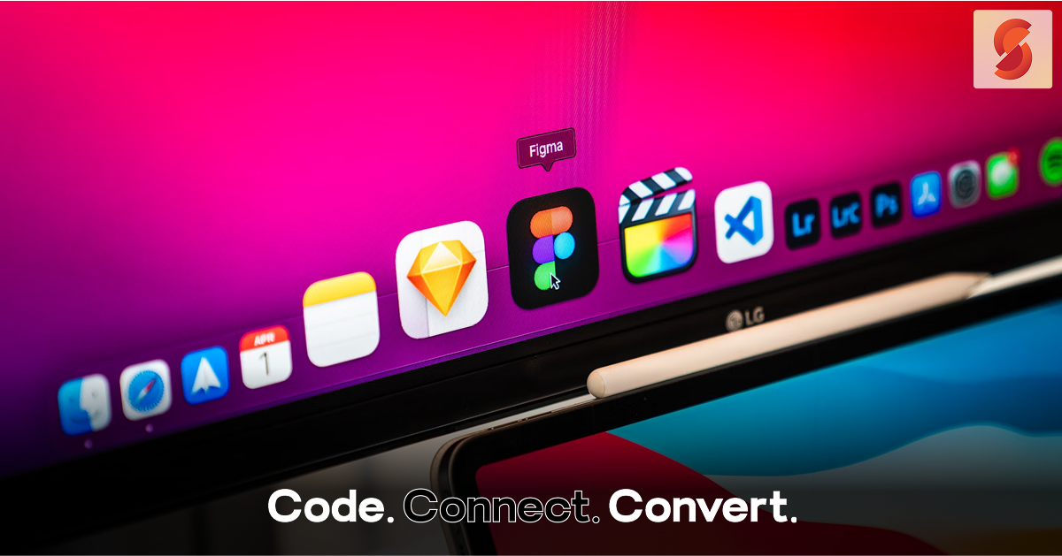
🎯 Tool used: Figma component library with shared tokens, spacing, and auto layout rules.
Step 2: Build a Shared Language Between UX & Dev 🧾
Before handing anything off, we sync with our dev team and clarify:
- What’s reused vs. custom?
- What UI logic or conditions are needed?
- What API data connects with which visual element?
- What error states or fallbacks should be handled?
We avoid ambiguity by:
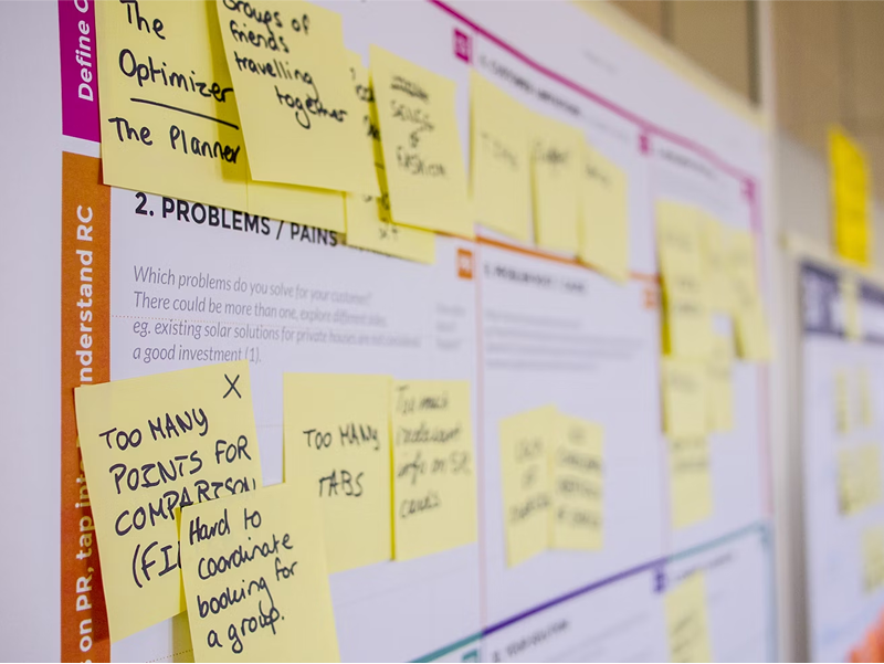
- Creating UI specs inside Figma frames
- Documenting logic and state changes using sticky notes or embedded flows
- Maintaining a UI glossary for consistent naming
🤝 This isn’t a one-way transfer. It’s collaborative.
Step 3: Use Tools That Translate Design Into Dev-Ready Assets 📦
We don’t rely on screenshots or PDFs. Instead, we use developer-integrated design tools:
Tools We Use 🛠️ :
| Tool | Purpose |
| Figma | Design + inspection for CSS, dimensions, spacing, etc. |
| Zeplin | Auto-exporting assets + developer style guides (ideal for icons/images) |
| Storybook | Live documentation of actual dev components—keeps design aligned with what’s coded |
| Lokalise | For text content and translations (reduces back-and-forth on content strings) |
Step 4: Establish a Feedback Loop – Not a Throw-Over-the-Wall 🔄
Our team never hands over designs and disappears.
We set up:
- Dev-ready checklists for each screen
- A shared QA board where designers can verify live builds before UAT
- Weekly Design x Dev syncs for clarifying blockers and priorities
- Slack channel for design queries, managed via threads
And most importantly—we empower devs to flag anything that feels off early.
🔁 Result: Less rework. More trust. Stronger team culture.
Step 5: Validate Design Fidelity Post-Implementation 🧪
Once dev work starts hitting staging:
- Designers do live QA against Figma files (desktop + mobile)
- We compare spacing, colors, breakpoints, hover interactions, and behavior under edge cases
- Bugs or mismatches are logged in a dedicated “Design QA” column in ClickUp or Jira
🎯 Our goal: Deliver pixel-consistent, logic-consistent, user-consistent UI—regardless of platform.
Results of Streamlining Our UX-Dev Handoff 🚀
| Metric | Before | After |
| Average handoff-related fixes | 12–18 per feature | 4–6 |
| Time to dev-ready approval | 3–4 days | 1–2 days |
| QA rejection rate | 28% | <10% |
| Dev feedback satisfaction | Mixed | Excellent ✅ |
This translates directly into faster launch cycles, cleaner builds, and happier teams.
Final Takeaways 📌
Design and development are not two separate silos—they’re two halves of a shared vision.
To bridge the UX-dev handoff gap:
- Design with dev in mind
- Document logic and behaviors clearly
- Use tools like Figma, Zeplin, and Storybook
- Collaborate closely, not just transfer files
- Test designs in the real build—and adjust fast
Because the best user experiences don’t just look great in Figma—they work flawlessly in production.